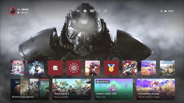
What do you think about the visual style (not layout) of the current Xbox Dashboard?
 |
Im talking about the general design, not the layout! I personally like the design. Is elegant and minimal without being TOO minimal, you know. I like the dynamic bacgrounds and love the fact that i can choose the colors. I also like the "neon" lines around what is selected. The sounds are cool as well, but i do prefer the ones from the early Xbox One Dashboard. |