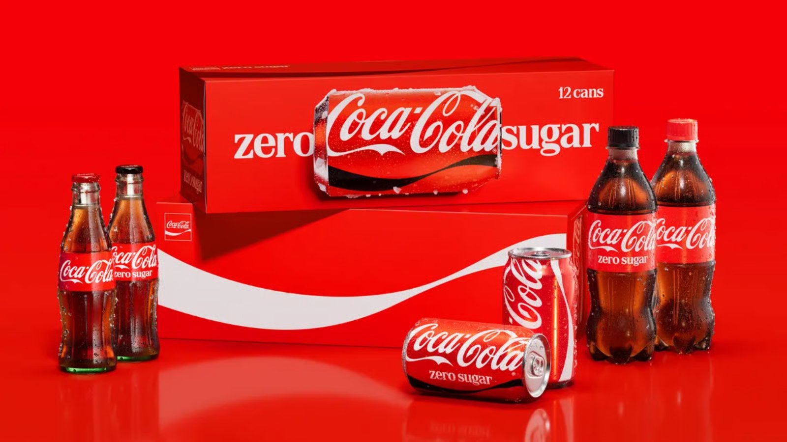
Coca-Cola reveals new Coke can designs in massive global brand refresh

Coca-Cola has unveiled updated can designs as part of a global brand refresh spanning packaging, stores, vending machines and digital platforms.
Coke is changing up its look, but the company is not abandoning its iconic red cans or famous cursive logo.
On July 20, Coca-Cola announced a new visual system designed to make its branding more consistent across more than 200 markets.
The refresh places greater emphasis on familiar elements, including Coca-Cola’s red and white color scheme, Spencerian script logo, Dynamic Ribbon and Arden Square.
“This refresh is about being clearer and more consistent in how we show up, wherever people experience our brand,” Coca-Cola Global Category President Arnab Roy said.
According to Transform magazine, branding agency JKR developed the new global identity, while design studio The Superultrarare reworked its packaging system.
Coke Zero Sugar cans get a bolder redesign
Coca-Cola Zero Sugar is receiving the most noticeable packaging changes. New cans feature much larger “Zero Sugar” lettering and a prominent black version of Coke’s Dynamic Ribbon.
Plastic bottles will also come with black caps, making the zero sugar option easier to distinguish from regular Coke.
Despite the changes, Coca-Cola says the goal was not to create a new logo or completely replace its existing branding. Instead, the company wanted to make the different versions of Coke feel like part of one connected product lineup.
Coca-Cola’s Rapha Abreu told Creative Bloq that the brief was simple: “Make Coca-Cola more Coca-Cola, everywhere.”
The overhaul follows Coke’s previous global branding update in 2021, which introduced its “Real Magic” platform and the curved “Hug” logo.
The new designs are currently rolling out across Latin America, Europe, the Middle East and Asia. Coca-Cola has not announced when the refreshed packaging will reach North America.